Physical Address
304 North Cardinal St.
Dorchester Center, MA 02124
Physical Address
304 North Cardinal St.
Dorchester Center, MA 02124

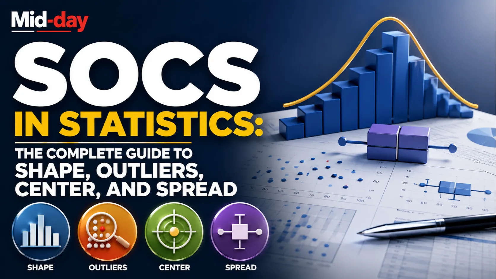
If you have ever been asked to describe a distribution in a statistics class and stared blankly at the graph not knowing where to start, SOCS is the framework that solves that problem. It stands for Shape, Outliers, Center, and Spread, and it gives you a consistent, four-part checklist for describing any distribution of quantitative data completely and in the right order.
SOCS is most commonly taught in AP Statistics courses, but it is just as useful in introductory college statistics and any context where someone needs to summarize what a dataset looks like. This guide covers what each part of SOCS means, how to use it correctly, and the common mistakes that cost students points even when they understand the individual concepts.
SOCS is a mnemonic acronym used in statistics to describe distributions of quantitative data. It stands for:
These four components together produce a complete description of a distribution. Addressing all four, with appropriate context and the correct statistical language, is what is expected on the AP Statistics exam and in formal data analysis work.

Describing a distribution is one of the most fundamental skills in statistics, and it comes up repeatedly throughout any statistics course. On the AP Statistics exam, free-response question 1 almost always requires describing distributions, and SOCS-related skills appear again in later units when analyzing inference results.
The challenge is not that the concepts are difficult. The challenge is that students often describe some components well and skip others entirely, or they describe the graph without connecting it to the real-world context of the data. SOCS provides the structure to ensure nothing is missed.
“Shape” describes the overall visual form of a distribution when plotted on a graph such as a histogram, dotplot, or stemplot.
Symmetric: The left and right halves of the distribution are roughly mirror images. A classic bell-shaped distribution is one example of a symmetric distribution. When a distribution is symmetric, the mean and median are close to each other.
Skewed right (positively skewed): The tail of the distribution extends further to the right. There are a few unusually large values pulling the distribution to the right. When a distribution is skewed right, the mean is typically greater than the median, because the mean is pulled toward the high extreme values.
Skewed left (negatively skewed): The tail of the distribution extends further to the left. There are a few unusually small values pulling the distribution to the left. When a distribution is skewed left, the mean is typically less than the median.
Unimodal: The distribution has one clear peak or cluster. This is the most common shape.
Bimodal: The distribution has two distinct peaks. This often suggests that two different groups are mixed together in the data.
Approximately uniform: Values are spread relatively evenly across the range with no strong peak.
When describing shape, always specify both the symmetry or direction of skew and the number of peaks. For example, “the distribution is unimodal and roughly symmetric” or “the distribution is skewed right with a single peak” are both complete shape descriptions.
Outliers are individual values that fall unusually far from the rest of the distribution. They are either much larger or much smaller than the other values.
The formal rule for identifying outliers uses the interquartile range (IQR). A value is considered an outlier if it is
Where Q1 is the first quartile (25th percentile) and Q3 is the third quartile (75th percentile).
For example, if Q1 = 40 and Q3 = 60, the IQR is 20. The lower fence is 40 minus 30 = 10, and the upper fence is 60 plus 30 = 90. Any value below 10 or above 90 would be flagged as an outlier by this rule.
On the AP Statistics exam, many experienced instructors advise students to only discuss outliers when there are obvious ones visible in the graph or when the formal rule identifies them. Mentioning outliers when none exist, or describing normal variation as an outlier, is an error. When outliers are present, always note their approximate value and describe their direction, meaning whether they are unusually high or unusually low.
Outliers matter because they influence the choice of which center and spread statistics are most appropriate to report.
Center describes where the typical value in the distribution sits. It answers the question, “What is the middle of the data?”
There are two main measures of center in statistics:
Mean: The arithmetic average of all values in the dataset. The mean is calculated by summing all values and dividing by the number of observations. The mean is sensitive to outliers and to skewness, since extreme values pull it toward one end.
Median: The middle value when data is ordered from smallest to largest. If the dataset has an odd number of values, the median is the single middle value. If the dataset has an even number of values, the median is the average of the two middle values. The median is resistant to outliers, meaning extreme values do not dramatically shift it.
The choice between mean and median depends on the shape of the distribution and the presence of outliers.
A complete SOCS response typically names the specific measure used (mean or median) and gives its actual value. Simply saying “the center is about 50” without specifying whether this is the mean or median is not a complete answer.
Spread describes how variable or dispersed the data values are. It answers the question: how much do the values differ from each other or from the center?
The main measures of spread used in AP Statistics are:
Range: The difference between the maximum and minimum values. Range is the simplest measure of spread but is heavily influenced by outliers since it only uses the two most extreme values.
Interquartile Range (IQR): The difference between Q3 and Q1. The IQR represents the spread of the middle 50 percent of the data and is resistant to outliers. When the median is the preferred measure of center, the IQR is the corresponding preferred measure of spread.
Standard deviation: A measure of the typical or average distance that observations are from their mean. Standard deviation is the preferred measure of spread when the distribution is roughly symmetric with no significant outliers. When the mean is the preferred measure of center, standard deviation is the corresponding preferred measure of spread.
Variance: The square of the standard deviation. Variance is used in more advanced statistical calculations but is less intuitive as a standalone descriptive measure.
The choice of spread statistic should match the choice of center statistic:
Suppose you are given a histogram showing the distribution of test scores for 30 students on a recent exam. The scores range from 55 to 100, with most values clustering between 70 and 85, and one value at 55 that appears separated from the rest.
Using SOCS:
Shape: The distribution is unimodal and appears slightly left-skewed, with the single peak near 75 to 80 and a longer left tail extending toward lower scores.
Outliers: There appears to be one unusually low value around 55, which is separated from the main cluster of scores and may be an outlier.
Center: Because the distribution is slightly skewed and has a potential outlier, the median is the more appropriate measure of center. The median appears to be approximately 78.
Spread: The IQR is the more appropriate measure of spread given the skew and outlier. The IQR appears to be roughly 15, indicating that the middle 50 percent of scores span about 15 points.
Notice that the example uses specific numbers and connects each observation back to the context, the test scores of students, rather than describing the graph in the abstract.
SOCS is also used when comparing two or more distributions side by side, such as when two groups have their results displayed in side-by-side boxplots or back-to-back stemplots.
When comparing distributions, each component of SOCS must explicitly address both groups and use comparative language. On the AP Statistics exam, comparison questions require comparison words. Saying “Group A has a median of 75” is not enough. Saying “Group A has a higher median than Group B (75 versus 70)” is the kind of comparison that earns full credit.
A complete comparison might read, “Both distributions are roughly symmetric with no clear outliers. Group A has a higher center, with a median of 75 compared to 70 for Group B. Both groups have similar spread, with Group A’s IQR of 20 matching Group B’s IQR of 20.”
Even students who understand all four components of SOCS lose points on exam questions because of avoidable mistakes in how they apply the framework.
Not including context. The most common and most costly mistake is describing SOCS without mentioning what the data represents. Every statement should reference the variable being measured. Not “the distribution is right-skewed” but “the distribution of household incomes is right-skewed.” The AP Statistics exam rubric consistently requires context for full credit.
Reporting the wrong center for the shape. Using the mean as the measure of center for a heavily skewed distribution, or for a distribution with clear outliers, is a conceptual error. The mean is pulled toward the extreme values in these cases, making the median a more informative summary. Matching the center and spread statistics to the shape is a sign of genuine statistical understanding, not just memorized vocabulary.
Describing shape from a boxplot. A boxplot does not reliably show shape. You cannot determine skewness purely from a boxplot’s whiskers, since the whisker length depends on both density and range. Histograms and dotplots are the appropriate graphs for assessing shape. On a boxplot question, students should focus on center, spread, and outliers and be cautious about strong shape claims unless the question specifically addresses it.
Stopping at outlier identification without explaining their effect. Mentioning that an outlier exists is only part of a complete response. Noting that the outlier is affecting the mean upward, making the median a better measure of center, shows deeper understanding.
Using vague language for center and spread. “The center is around 50” is less informative than “the median is approximately 50. ” Specifying which statistic you are reporting is always better.
Some teachers and textbooks use alternative mnemonics for the same concept. CUSS stands for Center, Unusual features, Shape, and Spread. Some versions replace “outliers” with “unusual features” to capture a broader category that includes gaps, clusters, and multiple peaks, not just isolated extreme values.
The underlying content is the same regardless of which acronym a course uses. SOCS is the most widely recognized mnemonic in AP Statistics specifically, but any framework that ensures all four components are addressed in context is functionally equivalent.
Understanding distributions through SOCS is not just a standalone skill. It is a precursor to more advanced statistical work. Before applying formal inference procedures like t-tests, confidence intervals, or regression, a statistician must understand whether the data meets the assumptions those procedures require.
Knowing whether a distribution is symmetric or skewed, whether outliers are present, and where the center and spread sit directly informs which statistical tests are appropriate and whether transformations or data cleaning steps are needed before analysis. A student who understands SOCS as descriptive work rather than just exam technique is better prepared for every subsequent topic in statistics.
Skipping outliers when none are obvious. It is fine to say “no outliers are apparent” in response. What is not acceptable is simply omitting the O from SOCS entirely.
Using “normal” as a shape description without justification. Normal distribution is a specific mathematical concept with a precise definition. Calling a distribution “normal” without evidence is inaccurate. ” Roughly symmetric” or “approximately bell-shaped” are better choices when the data looks symmetric.
Reporting both mean and standard deviation for a skewed distribution. Presenting the mean as the center when the distribution is skewed suggests a misunderstanding of when the mean is an appropriate summary. Choose the median and IQR for skewed distributions.
Being too vague about the spread. Saying “the data is spread out” conveys no useful information. Name a specific measure (range, IQR, or standard deviation) and give its value.
SOCS is a framework, not just a checklist. Its value comes from providing a consistent, complete structure for describing what a dataset looks like. Shape tells you the pattern, outliers flag the exceptions, center anchors the typical value, and spread captures how much variability exists.
Used correctly, with specific statistical language and always in the context of the actual data being described, SOCS produces descriptions that are genuinely informative rather than superficial. Whether you are preparing for the AP Statistics exam or analyzing data in any context, the habit of working through all four components every time is what separates a thorough analysis from an incomplete one.
What does SOCS stand for in statistics? SOCS is an acronym that stands for Shape, Outliers, Center, and Spread. It is a framework used to describe the distribution of a quantitative variable completely and consistently.
When should you use SOCS? SOCS is used whenever you are asked to describe a quantitative distribution from a graph, such as a histogram, dotplot, stemplot, or boxplot. It is also used when comparing two or more distributions side by side.
What is the correct order for SOCS? The letters in SOCS suggest the order: shape, then outliers, then center, then spread. In practice, most teachers and exam rubrics accept any order as long as all four components are addressed. Some courses use CUSS (Center, Unusual features, Shape, Spread) or other orderings.
Should I use mean or median for the center in SOCS? If the distribution is roughly symmetric with no significant outliers, use the mean. If the distribution is skewed or has outliers, use the median, since it is not pulled toward the extreme values the way the mean is.
What measure of spread matches each measure of center? Standard deviation is the appropriate spread measure when reporting the mean. IQR (interquartile range) is the appropriate spread measure when reporting the median.
What are the formal outlier boundaries in statistics? An outlier is any value below Q1 minus 1.5 times the IQR, or above Q3 plus 1.5 times the IQR. These boundaries are sometimes called fences.
Can you determine shape from a boxplot? Not reliably. Boxplots show center, spread, and outliers well, but they do not clearly reveal shape. Histograms and dotplots are better suited to assessing shape.
What if there are no outliers? Still address the O in SOCS by stating that no outliers are apparent or that no values fall outside the formal outlier boundaries. Omitting it entirely is a mistake.
What is the difference between SOCS and CUSS? Both are mnemonics for the same four core components of describing a distribution. CUSS stands for Center, Unusual features, Shape, Spread. “Unusual features” is slightly broader than “outliers” since it can include gaps, clusters, and multiple peaks. The underlying statistical content is the same.
Is SOCS only used in AP Statistics? No. SOCS is most commonly taught in AP Statistics because it aligns with the College Board’s exam expectations, but the underlying framework for describing distributions, covering shape, unusual features, center, and variability, is used throughout introductory and applied statistics at any level.